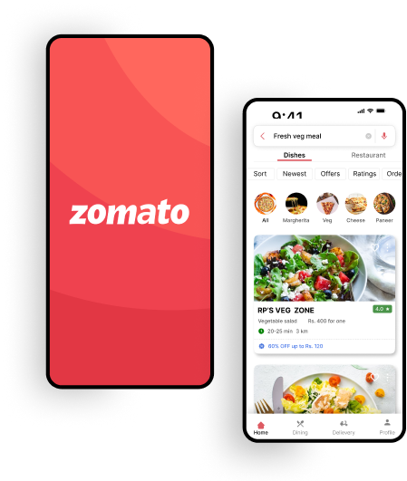
Enhancing User Experience in the Zomato App
A UX Case Study

A UX Case Study
In the era of modern convenience, food delivery apps have become an integral part of our daily lives. With the recent surge in their usage, particularly in the wake of the pandemic, ordering food through mobile apps has emerged as the go-to solution for countless individuals.
In this case study, I delve into the UX issues I encountered while using the widely popular Zomato food delivery app.
Imagine trying to order your favorite meal online, only to be confronted with a confusing and frustrating user experience. In this case study, I delve into the UX issues I encountered while using the Zomato food delivery app, highlighting the challenges faced by users and the solutions I proposed to enhance their overall experience.
One of the main UX issues I encountered while using the Zomato food delivery app revolved around navigation and ease of movement within the app. After conducting multiple searches for specific restaurants or food items, I found myself facing a significant challenge when I wanted to change my selection or explore other options.
The app lacked intuitive navigation options, making it difficult to go back or move to different sections within the app seamlessly.
While there was a back button for searching results, there were no clear options to navigate back or navigate to other areas within the app, leading to a frustrating user experience.
As part of my research to understand the user experience of the Zomato app, I have conducted user interviews to gather valuable insights and identify pain points. their feedback and experiences are crucial in helping me to improve the search function and navigation within the app.
There are some colleagues of mine who frequently use the Zomato app to order food. So, I asked some questions to them.
- Can you describe your typical experience when searching for a specific restaurant or food item on Zomato?
- Have you encountered any difficulties or frustrations when navigating within the Zomato app?
-How do you typically search for a specific restaurant or food item on Zomato?
-Can you describe any challenges or issues you’ve encountered during the search process?
-Do you feel that the search results are relevant and accurate to your search queries?
-What options or features would you expect to see after viewing the search results?
-After viewing the search results, how do you usually navigate within the Zomato app?
-Have you ever encountered any difficulties or confusion when trying to go back or explore other sections within the app?
-Are there any specific situations where you felt the lack of clear navigation options was particularly frustrating?
- Is there anything specific you would like to see improved in the search function or navigation within the Zomato app?
- Can you suggest any ideas or features that would make it easier for you to navigate within the app after viewing search results?
- Have you used any other food delivery apps with better navigation features? If so, what aspects did you find more intuitive or user-friendly?
Based on the user’s interview I found out their pain points, problems with going back to the respective tab are irritating when the shows the search results.
- Users often struggled to locate the search function within the app.
- Placing the search bar at the top of the screen significantly improves its visibility and accessibility.
- Retaining the bottom navigation menu in its default position maintains consistency and minimizes disruption to the existing user flow.
-Users appreciated the familiar bottom navigation menu and its ease of use.
- Users expressed difficulty in focusing on search results due to cluttered or distracting layouts.
The proposed solutions aim to address the identified pain points and challenges in the search function and navigation of the Zomato app. By implementing these enhancements, users will benefit from improved search accuracy, enhanced navigation options, and a seamless user experience.
These solutions focus on optimizing the user journey, providing clear navigation cues, and empowering users with greater control and flexibility within the app.
Move the search bar to the top of the screen for improved visibility and easy access. By placing the search bar prominently at the top, users can quickly initiate their search queries without the need for excessive scrolling or hunting for the search option.
This ensures that the search function remains a primary and easily discoverable feature of the Zomato app.
Keep the bottom navigation menu unchanged to maintain consistency and familiarity for existing users.
The bottom navigation menu, which typically includes options like Home, Discover, Orders, etc., serves as a reliable and accessible way for users to navigate between different sections of the app.
Retaining the bottom navigation menu in its default position ensures that users can easily switch between app sections without any disruption to their accustomed navigation pattern.
After performing a search, display the search results and related content in the central section of the app’s interface.
This ensures that users can focus on the search results without distractions and provides a clear visual hierarchy that highlights the relevant information.
By presenting the search results centrally, users can easily browse through the options and make informed decisions regarding their restaurant or food choices.
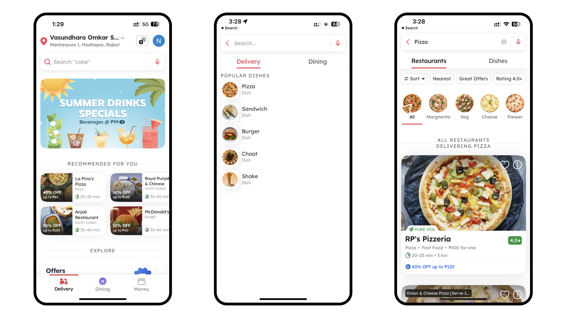
This screenshot displays the current search function UI within the Zomato app. Users enter their desired restaurant or food item in the search bar at the top.
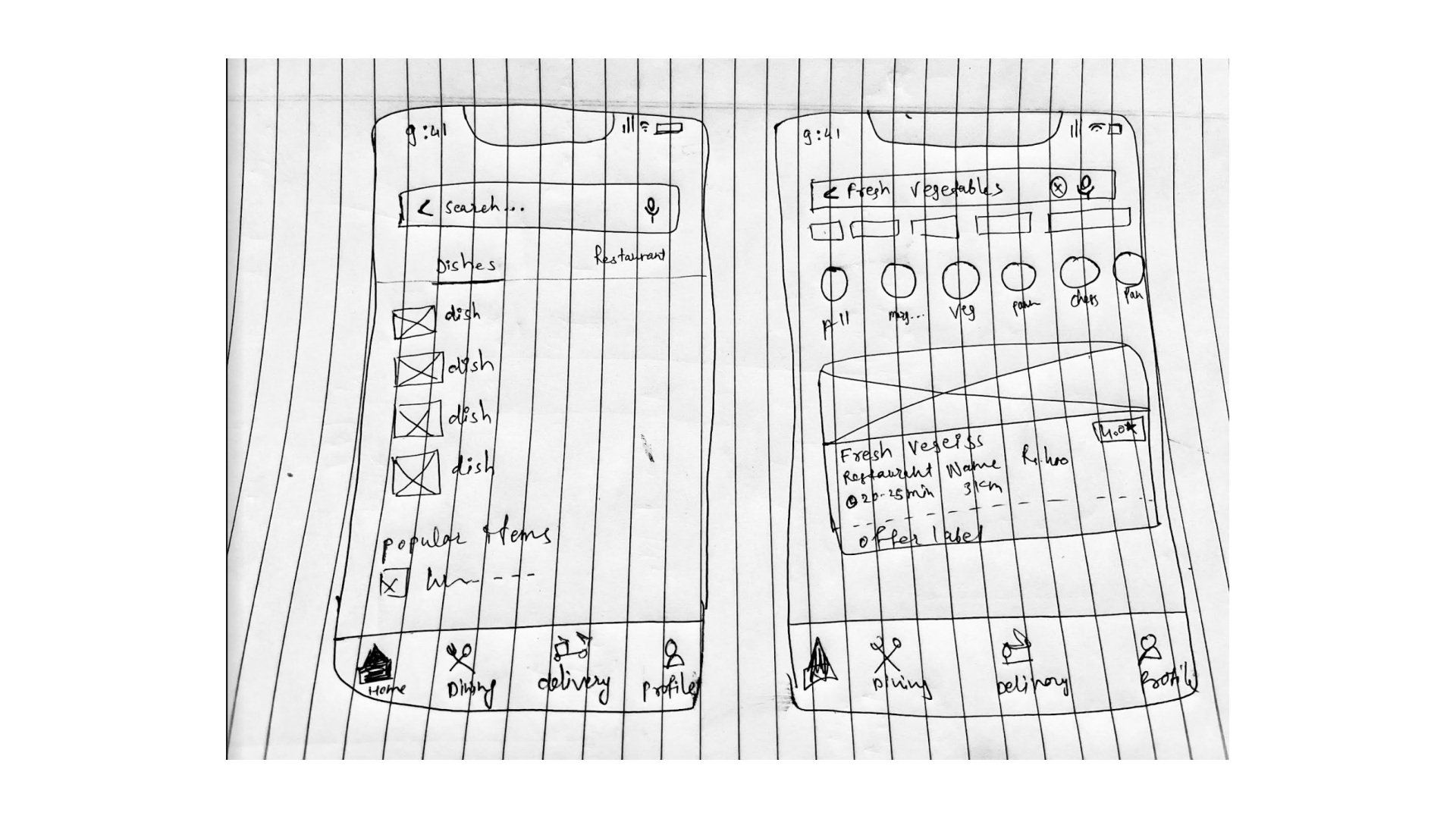
This section presents visual representations of the proposed solutions and enhancements for the search function and navigation within the Zomato app.
Through wireframes or hand-drawn app designs, I illustrate the intended changes, including the placement of the search bar at the top of the screen while retaining the unchanged bottom navigation menu.
These visuals provide a tangible representation of the proposed improvements and help readers envision the enhanced user experience within the app.
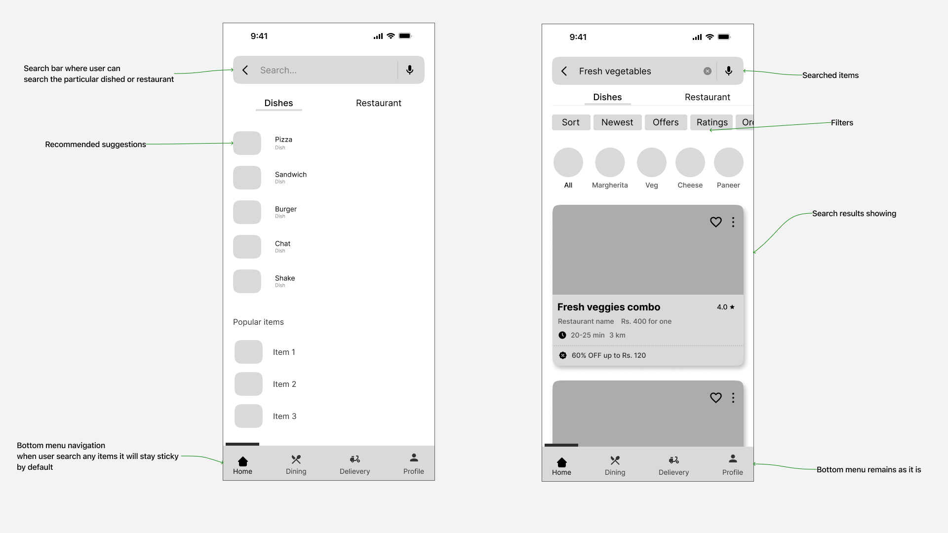
This wireframe showcases the proposed placement of the search bar at the top of the screen in the Zomato app.
After creating the wireframes it’s time to give a final touch to the screens. That is how it looks when all the elements are gathered.
I added some shapes, and colors (that Zomato has in their app), giving corner radius, giving same feel and same look that has now within the app.
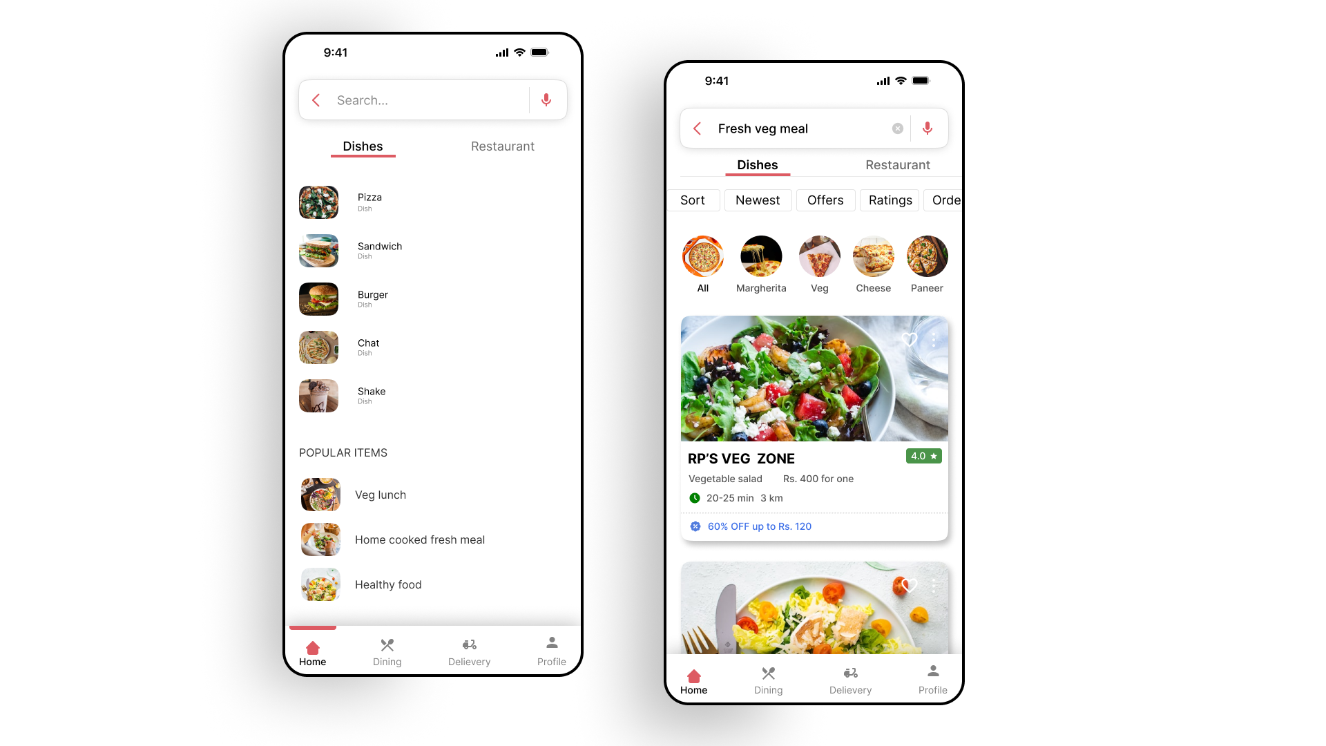
After creating the wireframes it’s time to give a final touch to the screens. I have gained invaluable insights and knowledge throughout my first UX case study, and I have put my best efforts to address the issues faced by users in the app and its elements. It has been a fulfilling experience to dive deep into user research, propose solutions, and create useful design improvements.
A Understanding the pain points and frustrations of users during the search process in the Zomato app, I have been able to propose enhancements such as placing the search bar at the top of the screen and retaining the bottom navigation menu. These changes aim to improve user experience and make the app more intuitive and user-friendly. improvements.
I hope you find this UX case study valuable and informative. I welcome your feedback and suggestions, as they will greatly contribute to further refining and strengthening my design approach.
Thank you for taking the time to review this case study, and I hope it inspires further discussions and improvements in the realm of UX design for any other apps.